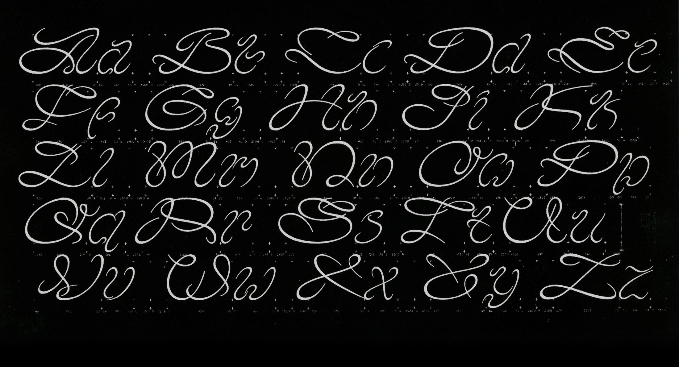
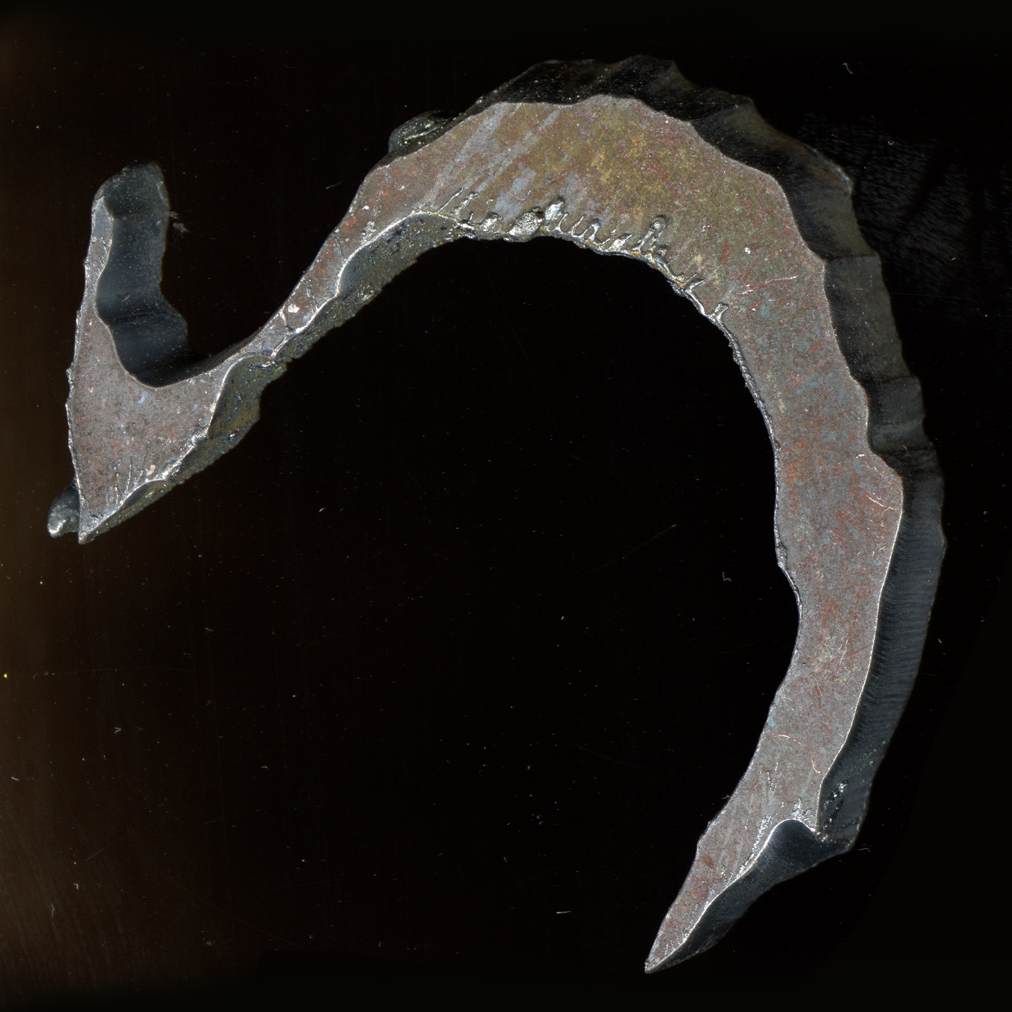
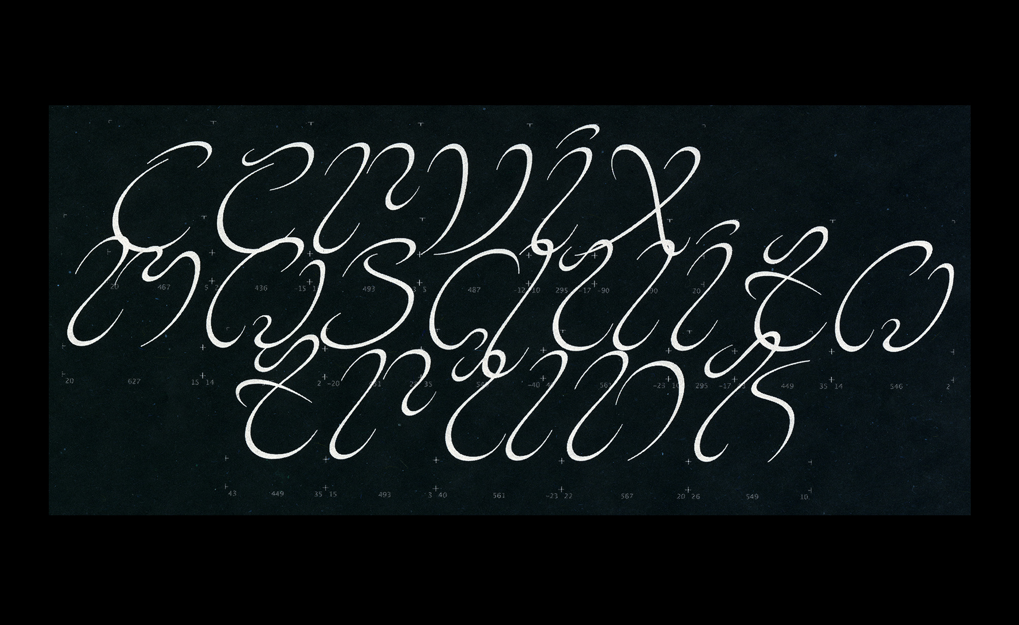
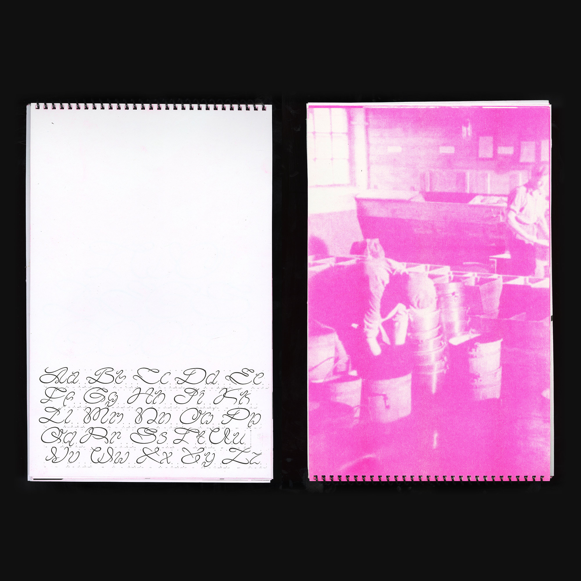
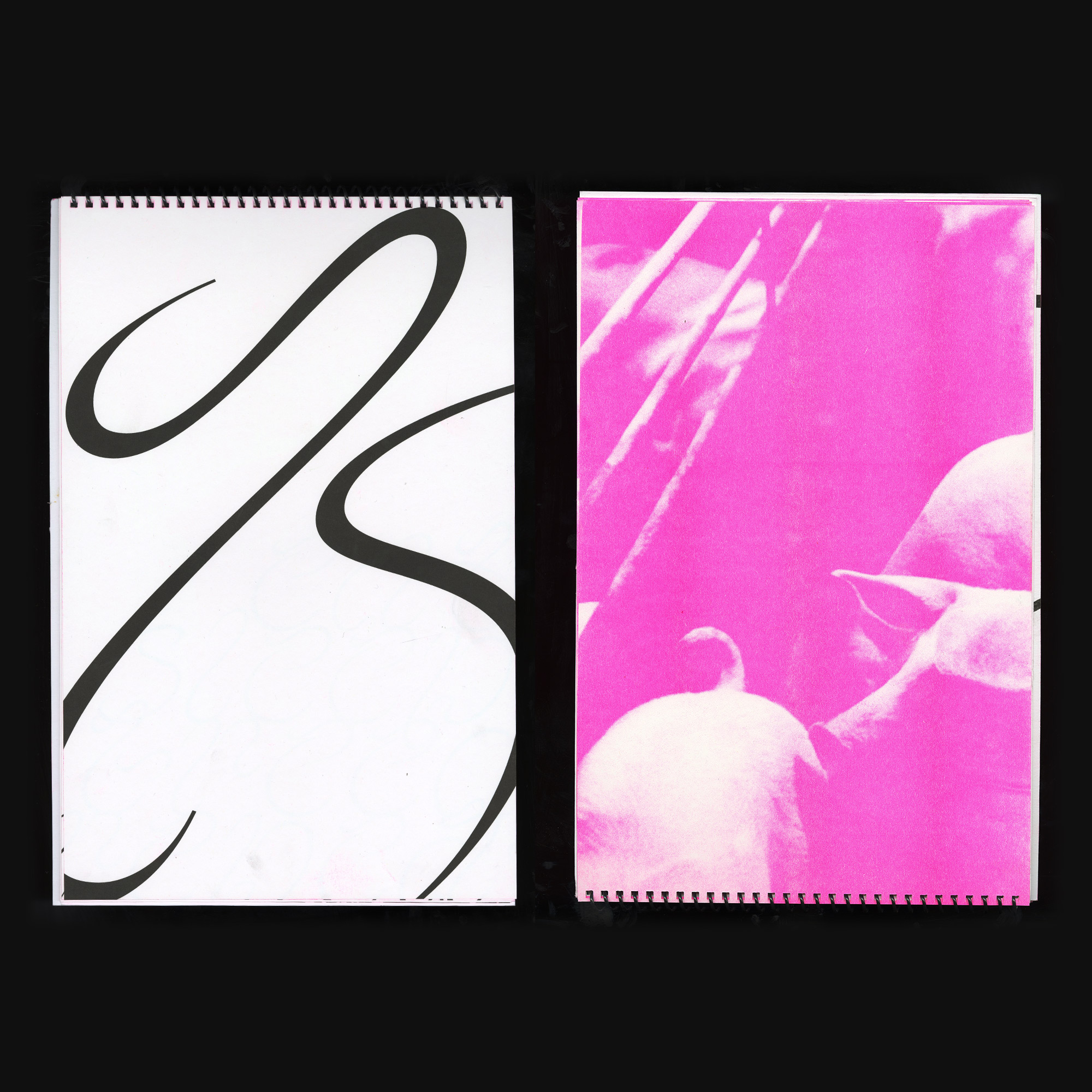
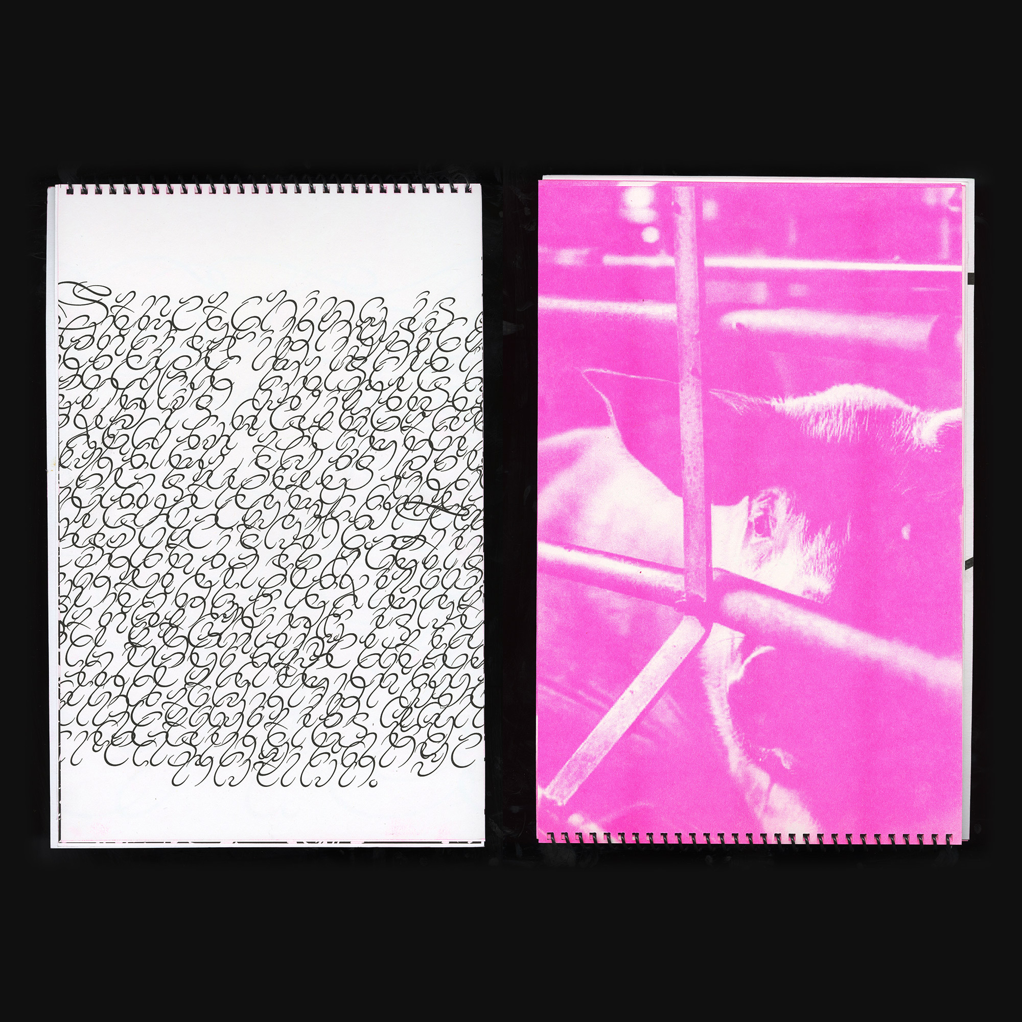
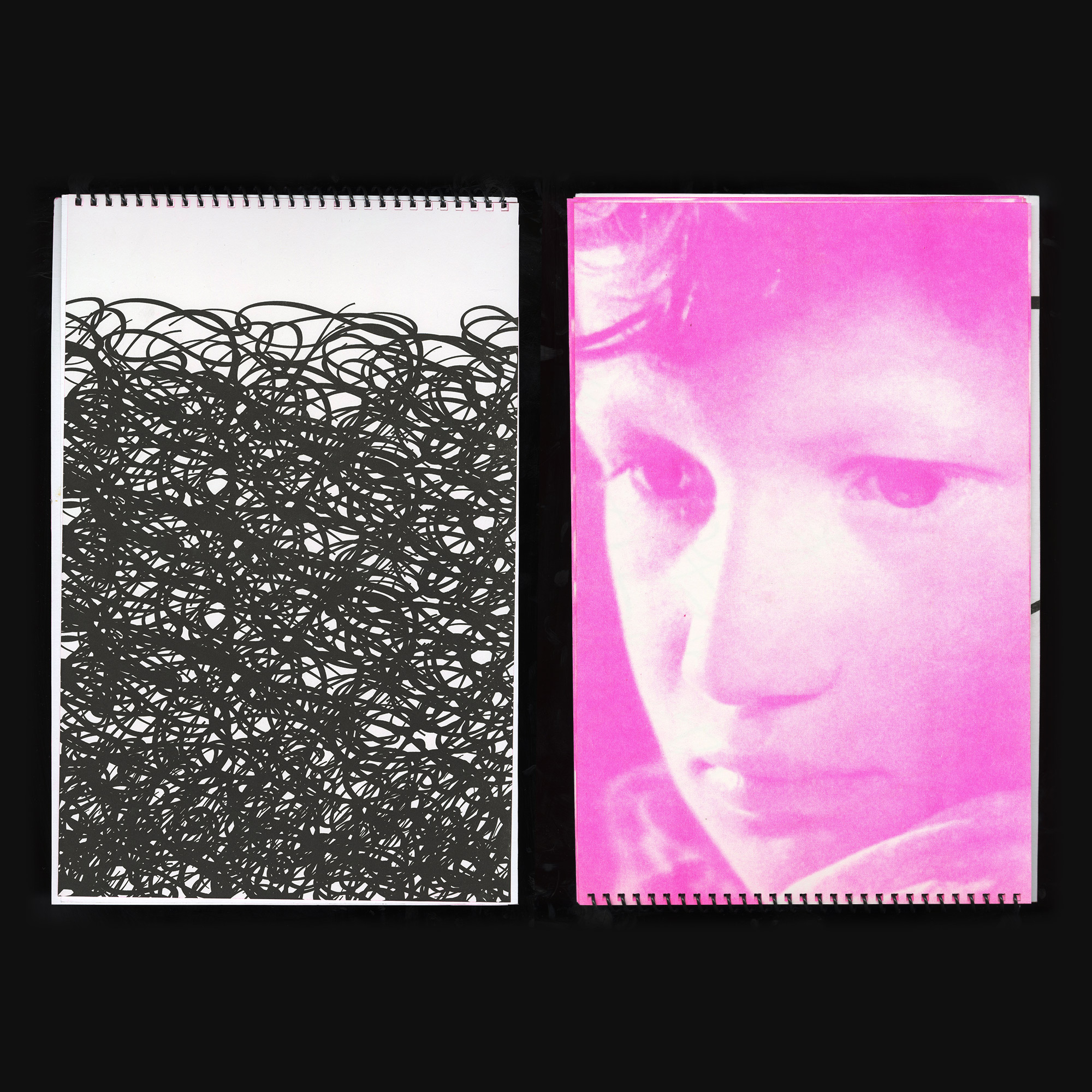
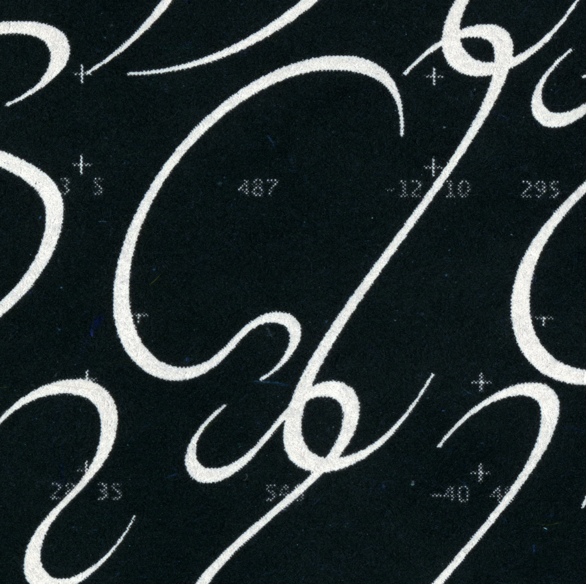
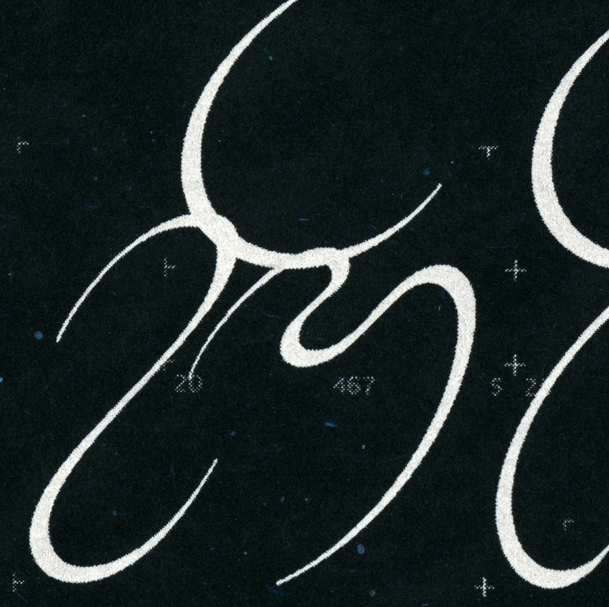
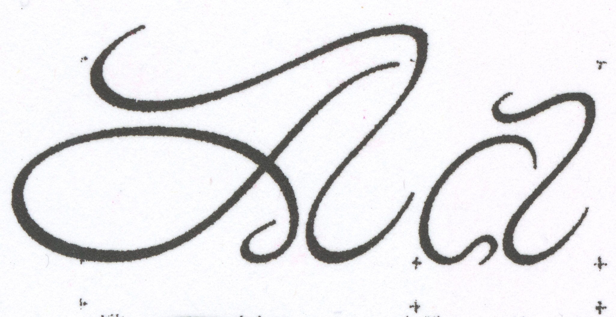
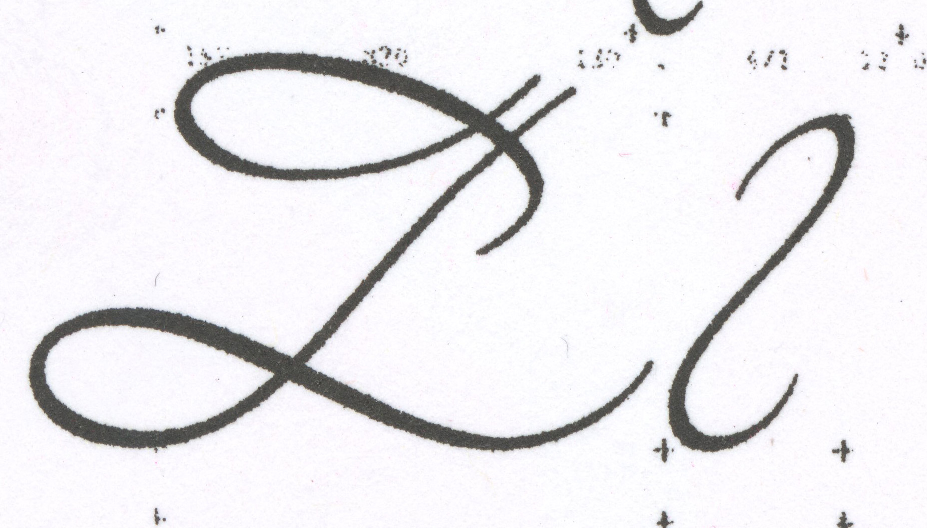
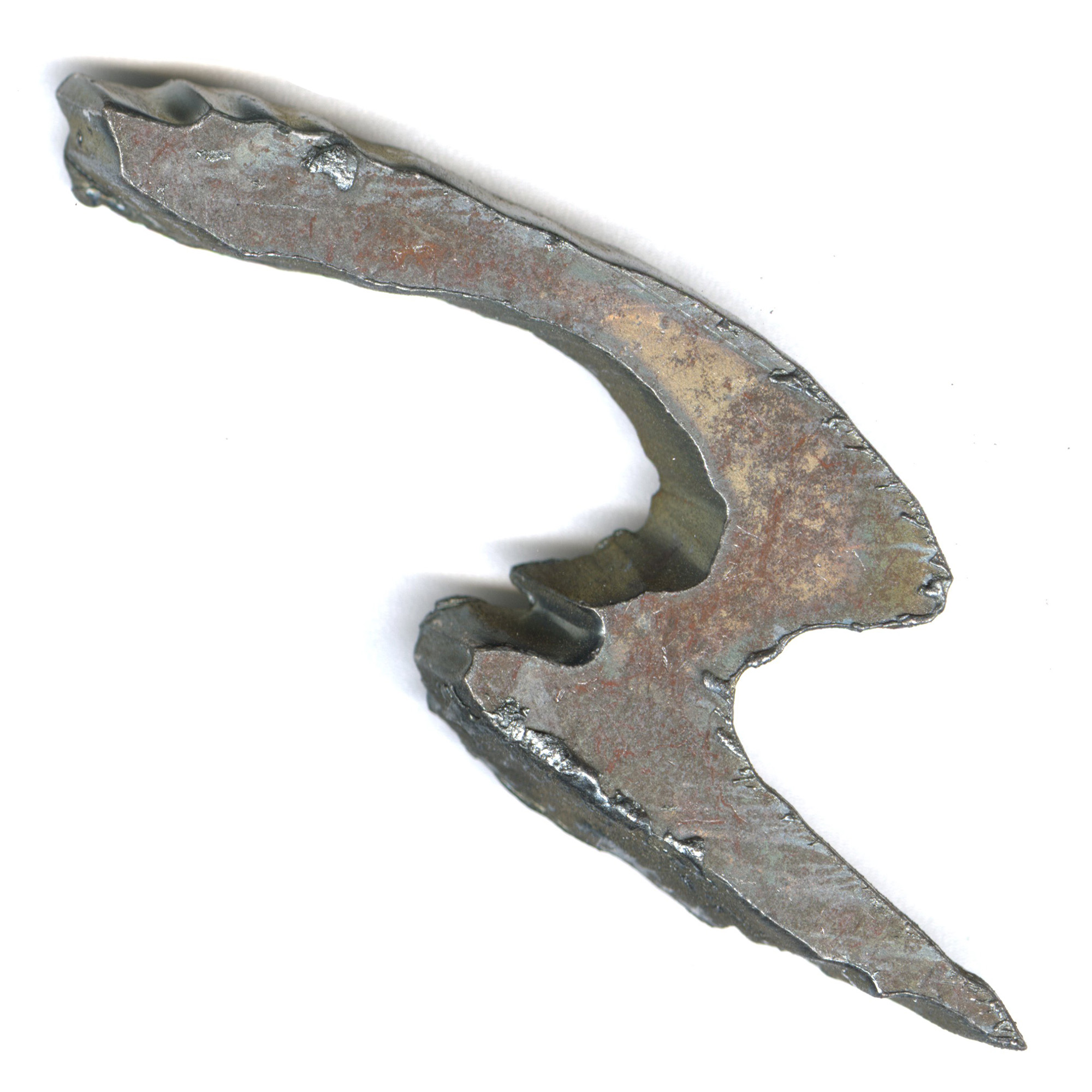
Elegant yet overwhelming, Swine needs a lot of space to thrive as a display font, but will adapt well in very tightly spaced sentences even though the readability might suffer. The first visual explorations for Swine was “drawn” in metal using a plasma cutter and thereby the automatic gestures of drawing with a broad pen or pencil was removed. It was later reintroduced to historical traditions of lettering ways of the broad pen + classic angles of contrast. Email for inquiries.
Swine
Type design
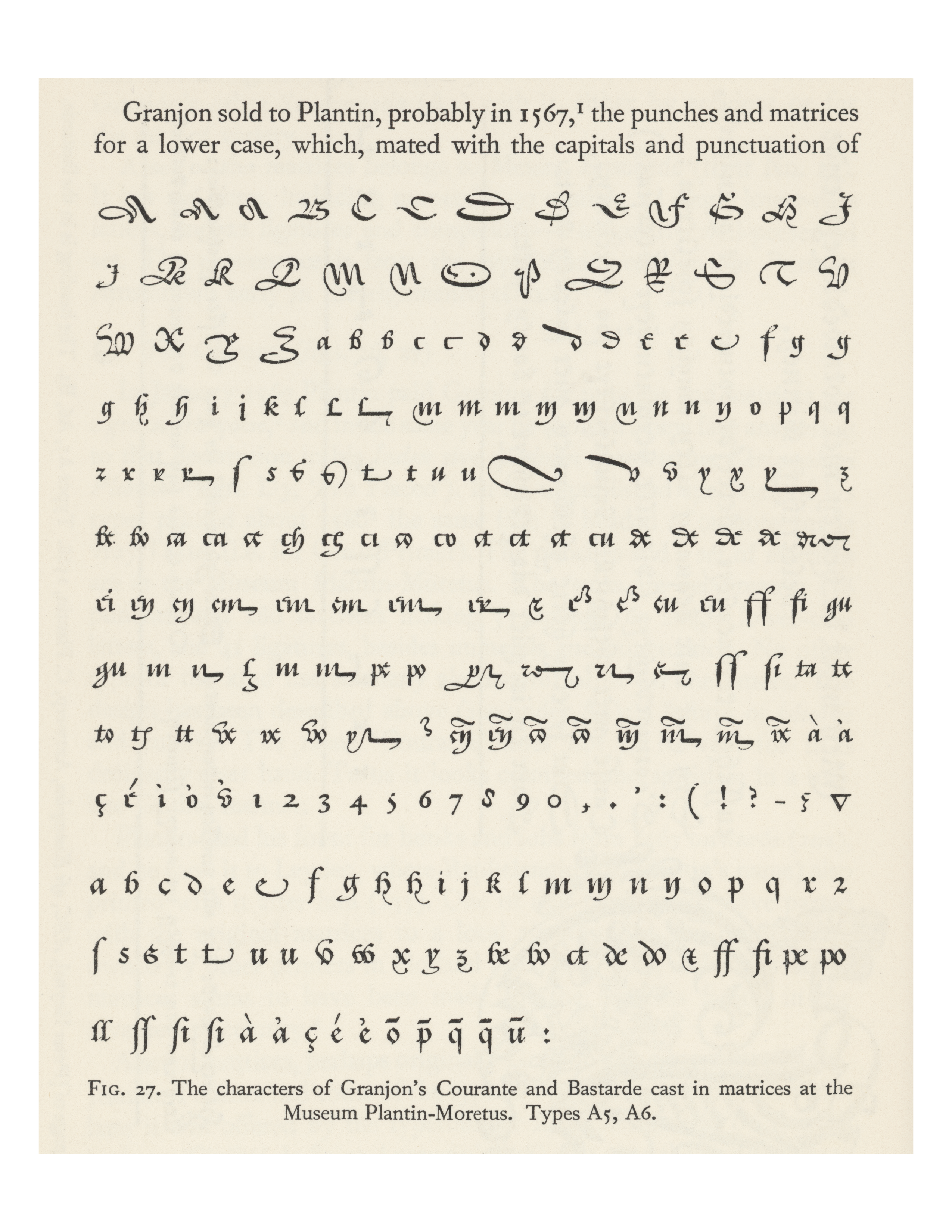
Artistic supervision by Prof. Tobias Frère Jones and Matthew Carter. Source material: Granjon Courante+Bastarde (Carter&Vervliet repro 1966 | 1800)