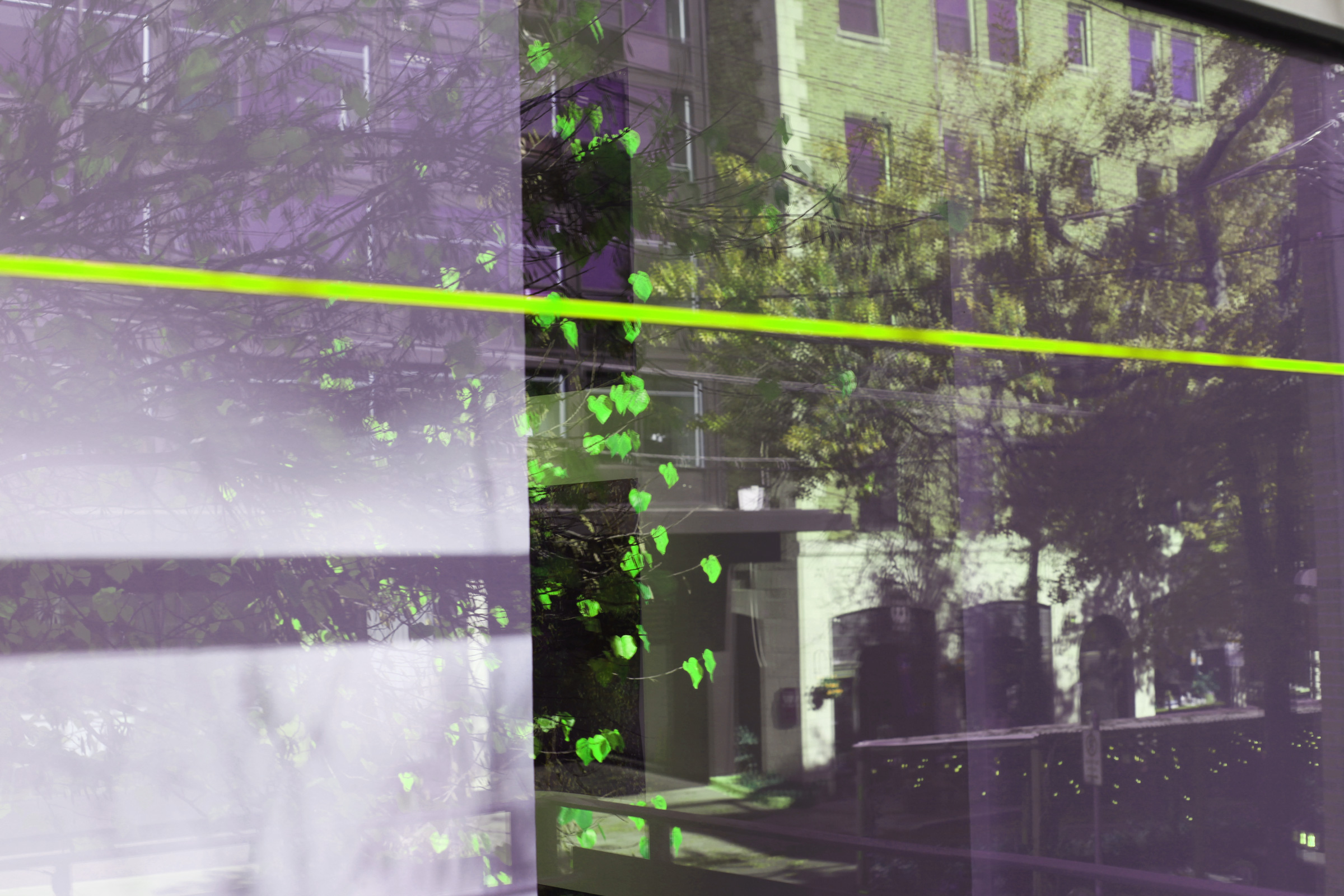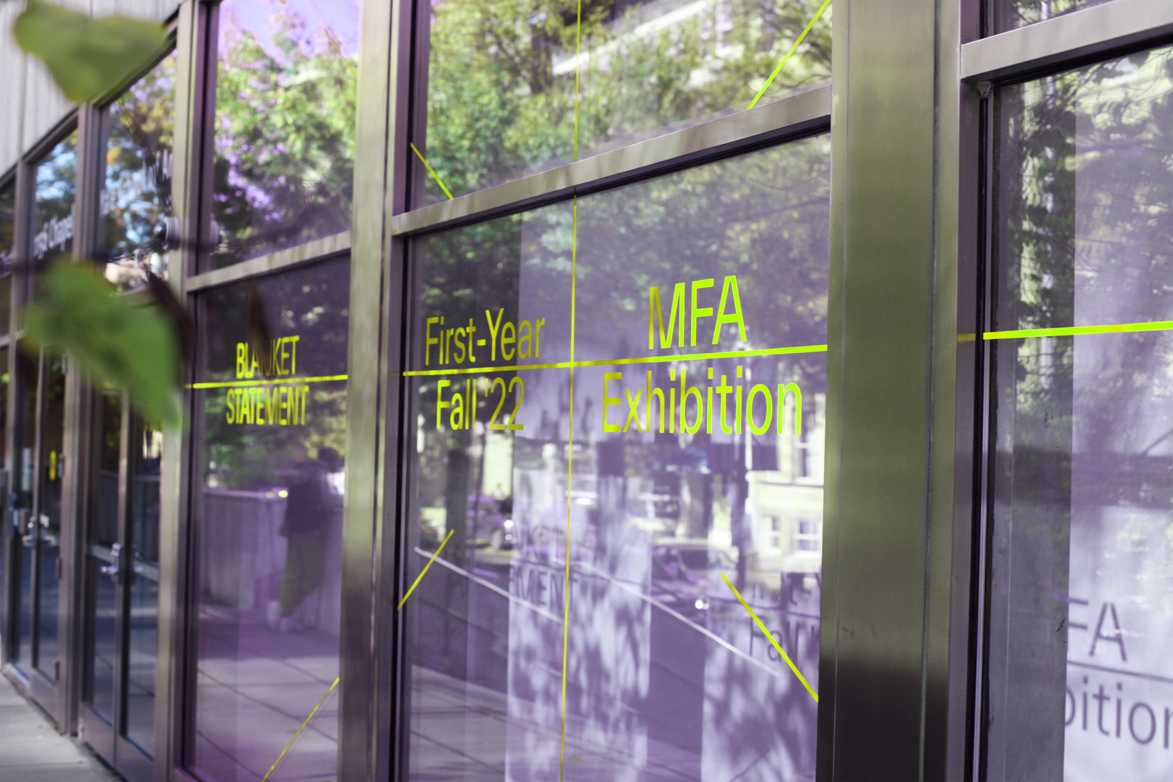
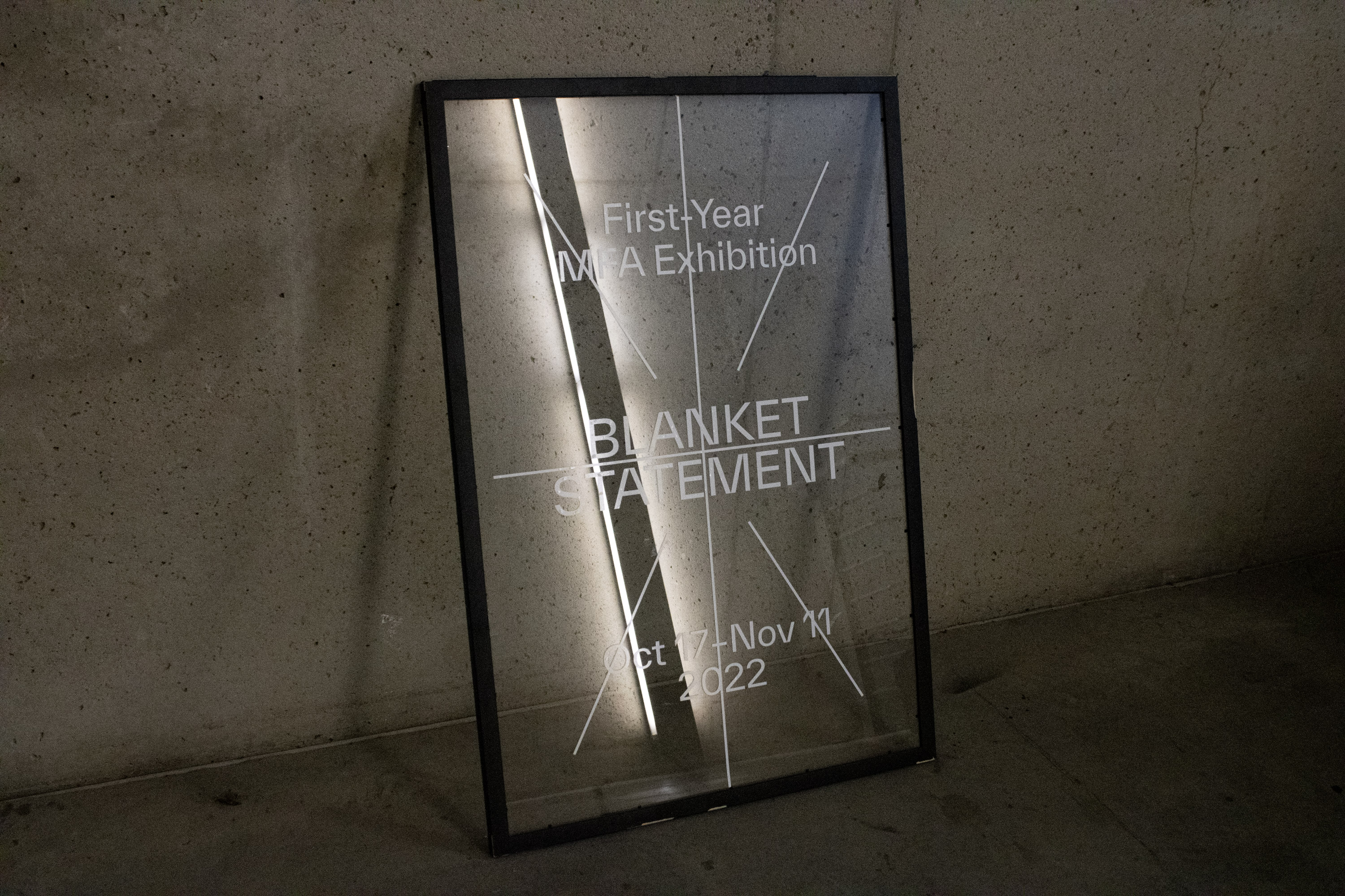
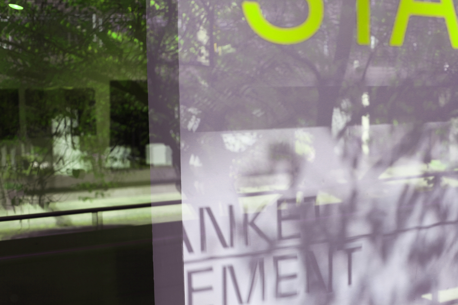
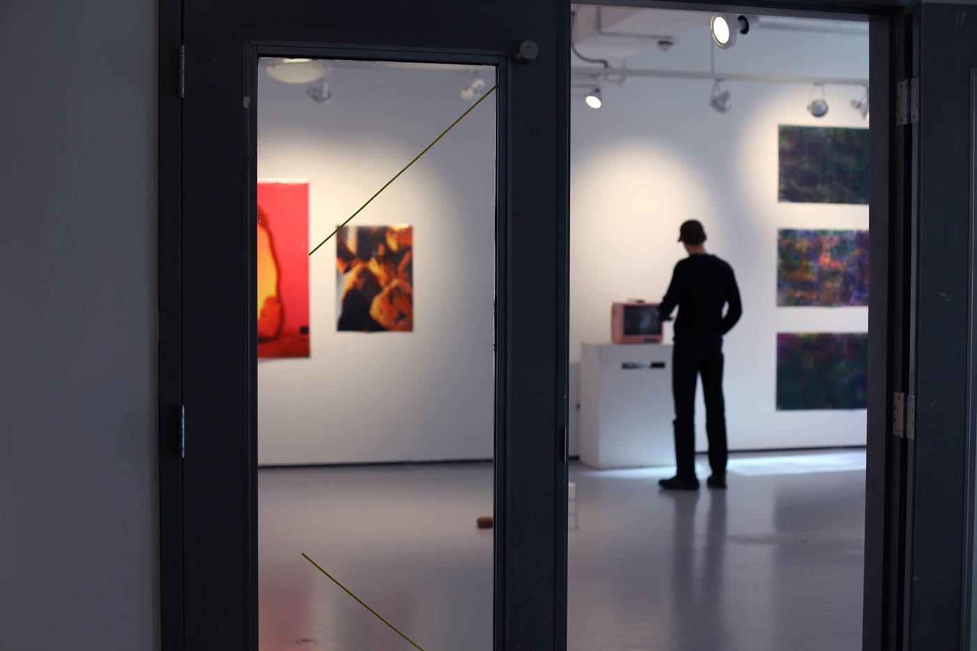
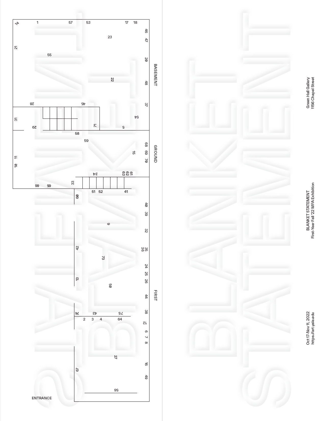
The exhibition design uses typography and symmetric lines to populate and transform the transparent surfaces of the gallery and in turn the architecture itself. By masking and de-masking the surfaces, the design areas act not only as screens, but rather as matrices. A matrix is a concept and means of transmission very familiar in graphic design, namely in print processes: A physical surface that can be manipulated to hold ink, which is then transferred to paper through a reversal. Most, though not all, matrices are able to print the same image many times.
Creating matrices are laboursome work which in turn enables very efficient reproduction techniques used in mass communication to this day. Even our LED screens can be seen as matrices of light. They form an illusion of shared orientation; imagine instead if your received texts arrived in reverse. Our perception of the world is that things have an inside and an outside or a front and a back, but how about typography?
With the design we wanted to expand the moment of shared meaning using the contact between subject and matrix as a metaphor for pure and invisible transmission (no one can ever witness it actually take place). Locating moments of mutual non identification can be the first step leading towards communal understanding, as we need to accept that we do not see the same thing even though we are looking at the same thing.
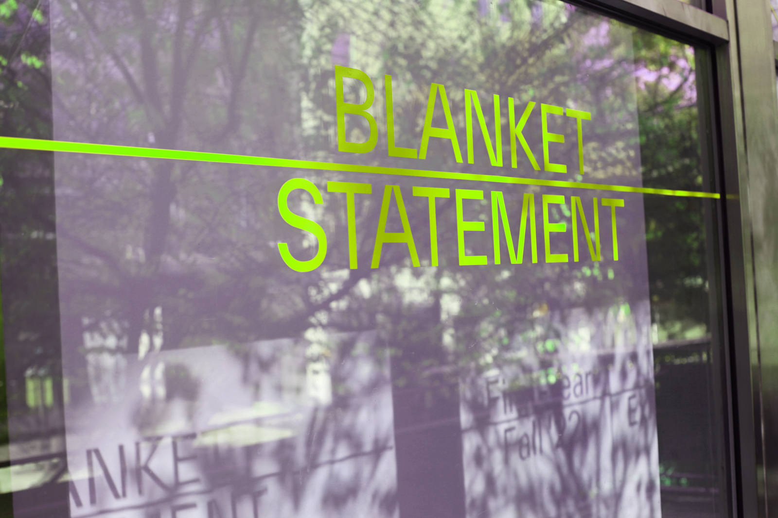
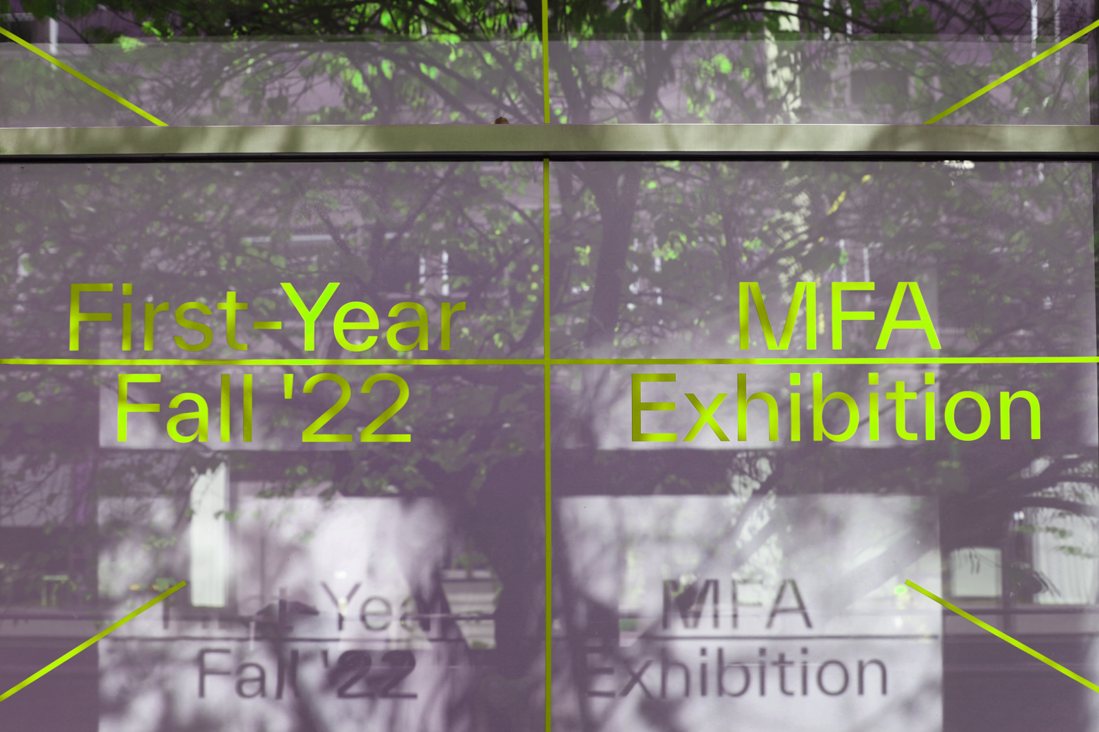
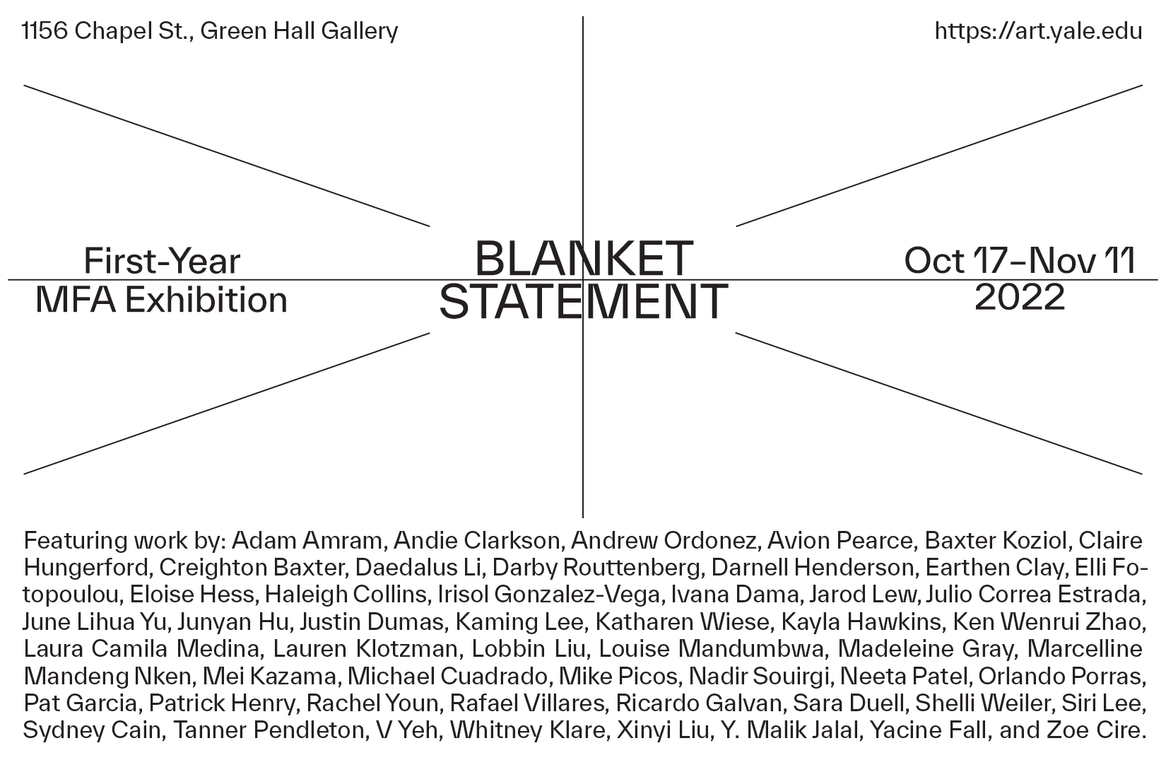
Blanket Statement
Visual identity, exhibition design
Project was made in collaboration with M.C. Madrigal for Yale School of Art. Font: Everett by WELTKERN
“I have been passing through this building, looking at the shadows, mulling over the absurdness of the imaginary line that sits in-between architecture and graphic design.”